Table Of Content
Increase conversions with live customer activity

the post below was written by David Krevitt, data analysis expert and creator of Coding is for Losers. -Ryan, founder
Over just the past 10 months, websites using Fomo have shown billions of notifications. That’s a lot of social proof.
But not all notifications are created equal.
Some land solidly, and excite the visitor to click through. Some completely whiff and are ignored.
But the good news is: what makes a notification land or whiff isn’t completely random.
There are patterns in social proof. Patterns that can be used directly to increase your engagement and sales.
To uncover those golden nuggets, we dove deep into the data from 4,716,654,911 unique impressions and clicks on Fomo notifications.
Based on data from last October 17 until August 30 of 2017, we found 5 key patterns in click behavior:
- Mobile notifications outperform desktop by 10%
- The classic (default) theme performed better than the rest
- Top-left is the highest performing notification position
- Non-popup notifications far outperform immediate popups
- Users prefer consistent notification timing to randomness
Read on to learn how you can tweak your Fomo settings to take advantage of each of these patterns.
Note: These patterns are not set in stone - as user behavior changes over time, we’ll refresh this post with updated insights.
Let's dive in.
Mobile beats desktop for engagement rates
Instinct would point to mobile notifications performing worse than desktop.
On the tight real estate of a smartphone screen, we assume any popup notification is intrusive.
But this couldn’t be farther from the truth: engagement rates (the percentage of Fomo popups shown that result in click-through) were 10% higher on mobile than desktop.
Mobile vs Desktop Engagement Rates
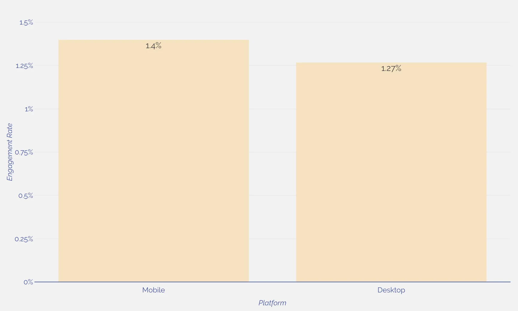
It appears that this tight real estate actually works to your advantage if you’re demonstrating social proof on your site.
Given that the notification takes up a relatively larger percentage of the screen, it’s more likely to get a look from the visitor.
And given the popup is informational, rather than simply asking for an email address - it’s also more likely to get a click.
Takeaway for Fomo users: Leave your mobile notifications on!
Stick with the Classic
This is distinctly not surprising.
The simplest, most unobtrusive Fomo notifications - our Classic theme - are the most likely to be clicked.

The Classic theme outperformed our other themes by over 40% on mobile, and 30% on desktop.
Obviously there were single sites that bucked this trend - but it points to a pretty clear preference for the simple look.
Mobile Engagement Rates by Theme
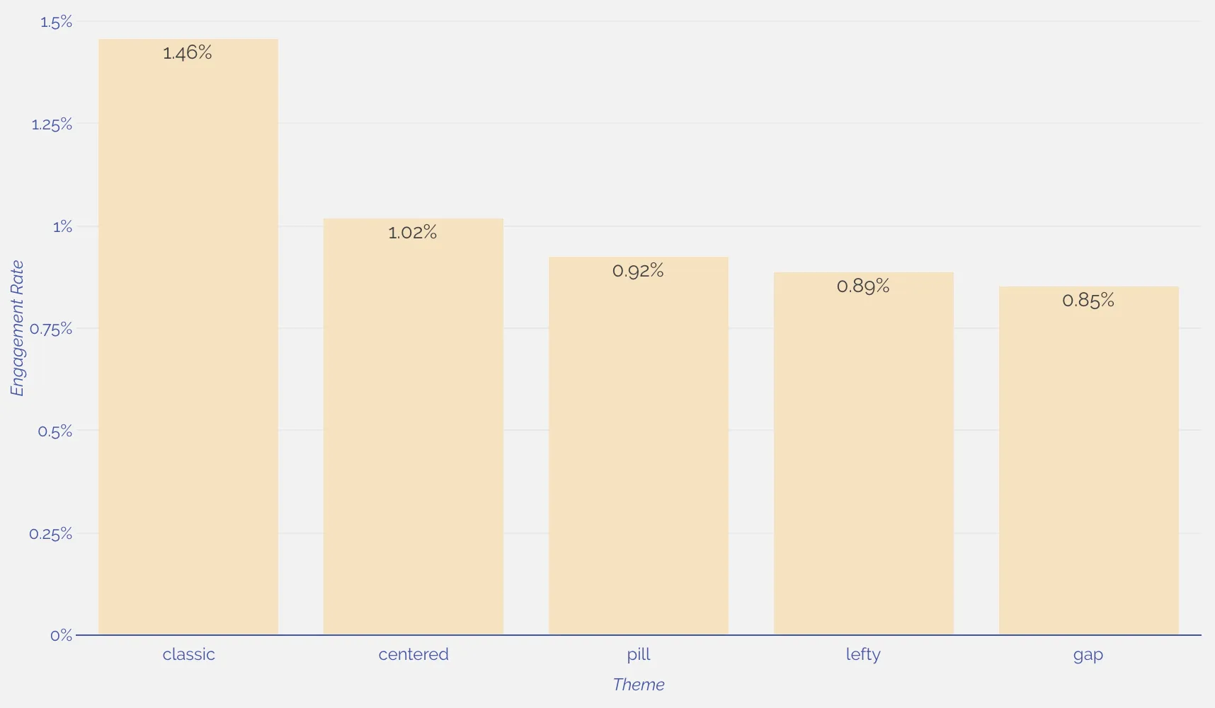
Takeaway for Fomo users: Stick with the Classic theme, unless it conflicts in a major way with your site’s design.
Can you go left?
In the western world, we read from left-to-right.
On the web, this manifests as us reading web pages in an F-shaped pattern. We read the nav bar, the first fold, and then scan the rest of the page.
One would think that showing a notification at the end of that F-shaped journey (at the bottom of the page) would be just fine, and not an interruption at all to the reader.
Wrong.
It turns out that notifications shown in the top-left - the front door of a webpage - outperform by over 30% on desktop.
Desktop Engagement Rates by Notification Position
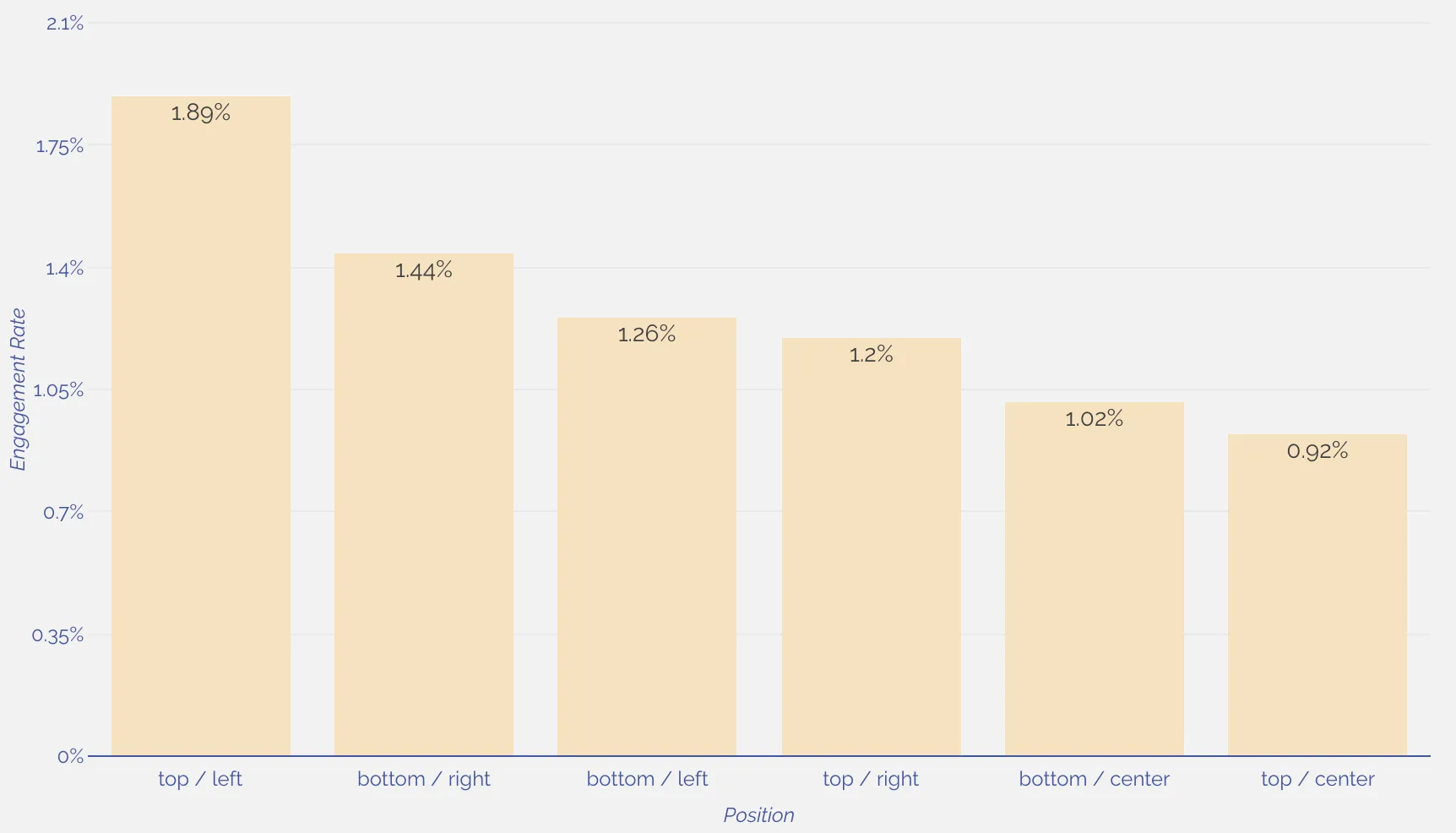
This data points to Fomo performing well as a welcome to your site (a la Hellobar), rather than a popup to digest once they’ve already browsed the rest of the page.
Also, notice what positioning performs worst on desktop: the center.
This suggests that notifications can either lead (from the left) or follow (from the right), but when they’re dead-center they’re more likely to be passed by.
Takeaway for Fomo users: Try placing notifications in the top-left on desktop.
Patience isn’t a virtue
Nobody likes being interrupted as soon as they walk into a new store.
But what if a notification isn’t a popup, but rather part of the store itself when it loads?
The proves this to be more pleasant to visitors, as notifications that load immediately outperform a 1-second delay by a wide margin.
The trend is super clear on mobile devices, where a 1-second initial delay for showing notifications performed over 40% worse than a 0-second (immediate load) delay.
Mobile Engagement Rates by Initial Delay
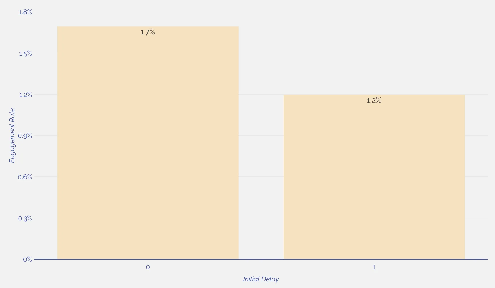
The same held true on desktop, where an immediate notification display outperformed 1-second by 47%.
Desktop Engagement Rates by Initial Delay

Sometimes great customer service means arming customers with good information as they’re walking in the door.
Takeaway for Fomo users: Set your initial delay for notifications to 0.
Users prefer consistency
Showing notifications at random intervals makes perfect sense: it mimics the stop-and-go action of a crowded business.
But the data shows that randomizing notification timing actually does not improve engagement rates.
In fact, on desktop, regularly timed notifications outperformed randomness by over 30%.
Desktop Engagement Rates by Randomness
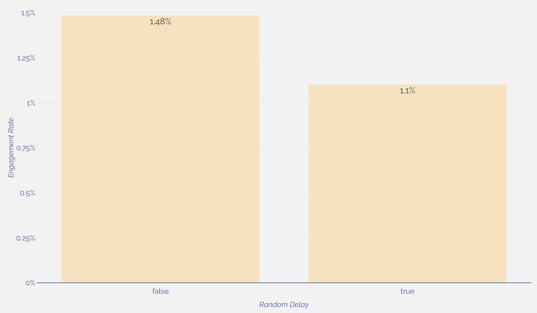
And the same trend held true on mobile, although slightly weaker at 17%.
Mobile Engagement Rates by Randomness
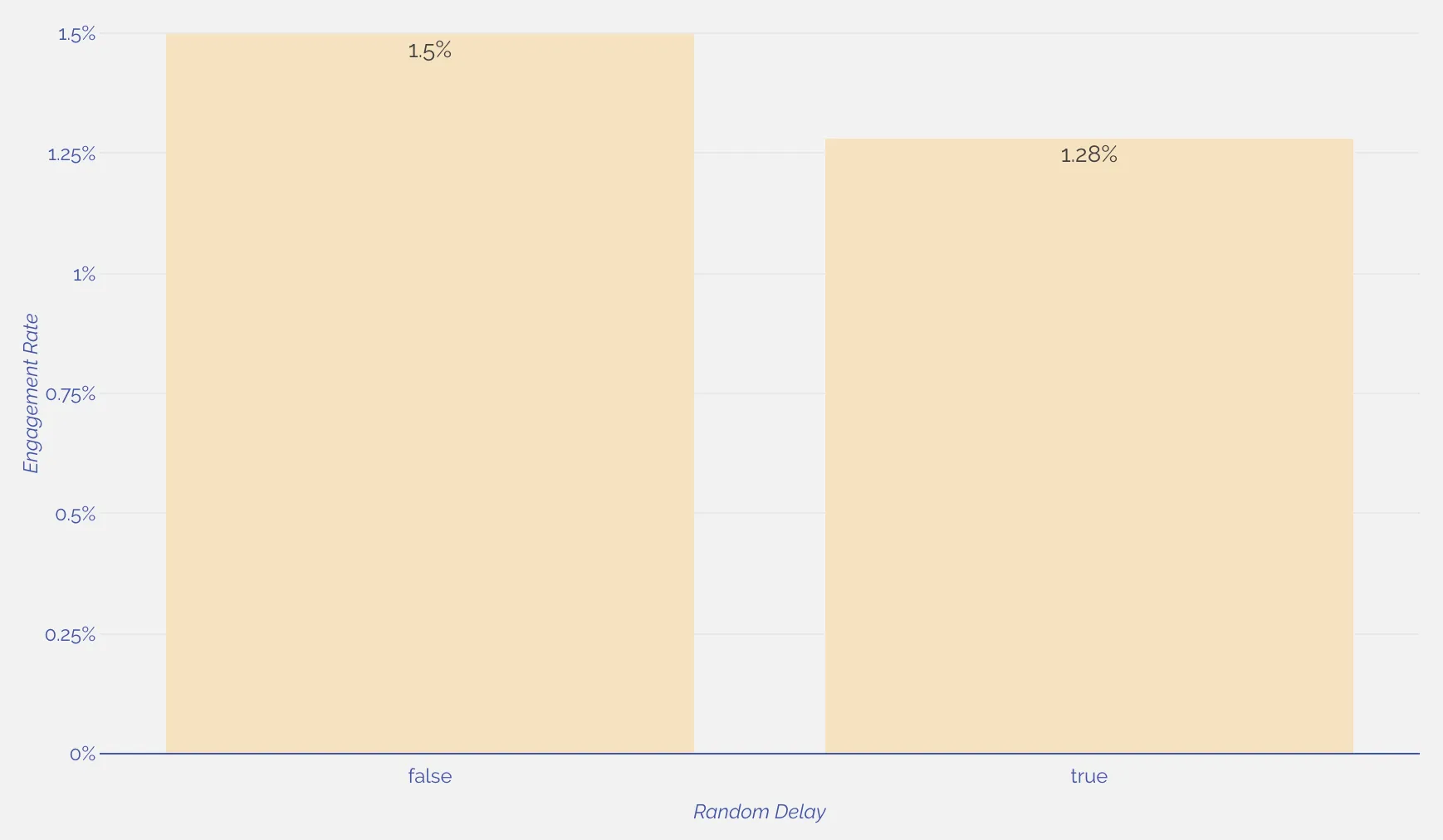
In general, users on the web seem to appreciative smoothness and consistency while they’re browsing.
It may be that random pop-ups and cycling of content may be just less pleasurable on the eye, and thus less likely to get love in the form of a click.
Takeaway for Fomo users: Try turning off randomizing delays between notifications.
Putting these insights into action
While these nuggets of insight are great, they’re pretty useless if you can’t put them into action.
So to take advantage of this newfound knowledge into user behavior, here’s 5 steps you can take in your Fomo setup today:
- Turn your mobile notifications on (if they aren’t already)
- Give the Classic theme a shot
- Try moving your notifications to the top-left position
- Set your initial delay to 0 seconds
- Turn off randomizing the delay between your notifications
Like we hinted at above, we’ll update these recommendations regularly, to make sure you’re squeezing the most engagement out of your Fomo notifications.


%201.svg)
%201.svg)


